Brand Identity Logo
Barlow Wealth Management Brand Identity
Logo design & brand guidelines
Barlow Wealth Management needed a brand identity that could carry real financial weight — the kind of mark that reassures a client handing over a retirement plan, not just a pretty logo.
A mark built on stability
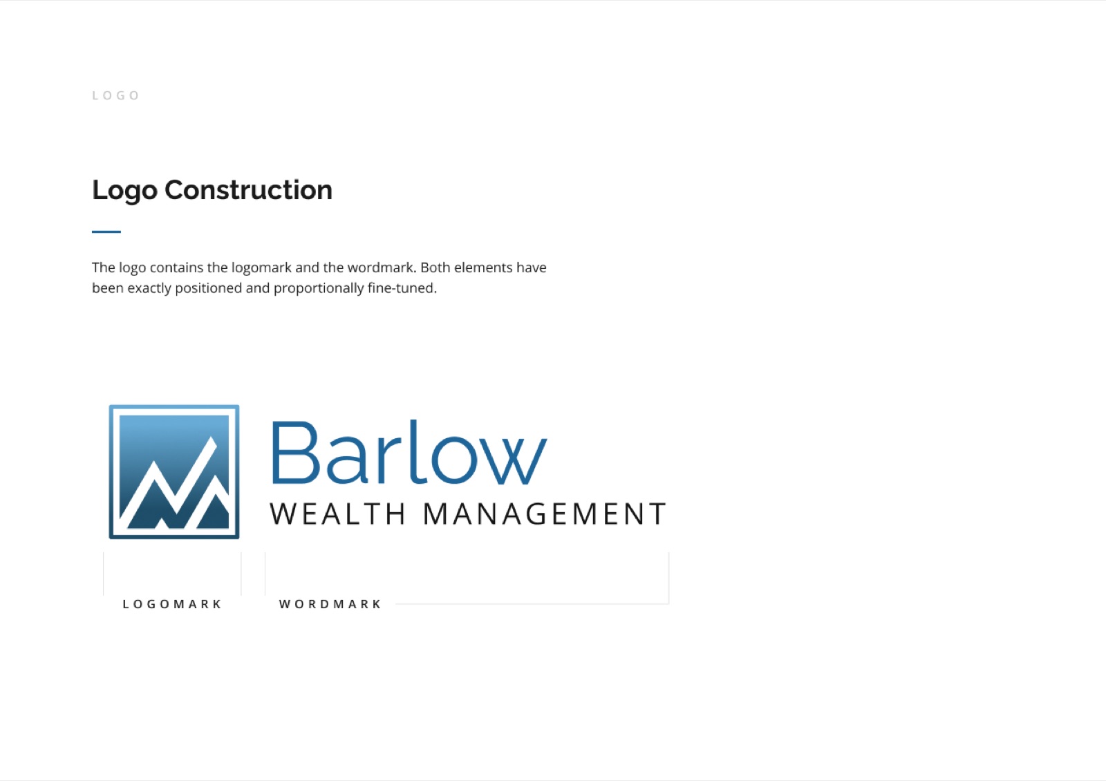
The logomark pairs an ascending, market-line peak inside a squared frame — a nod to both financial growth and steady, deliberate planning. Paired with the wordmark, it reads as established and precise rather than flashy, which matters more than trend-chasing in this industry.
A full identity system
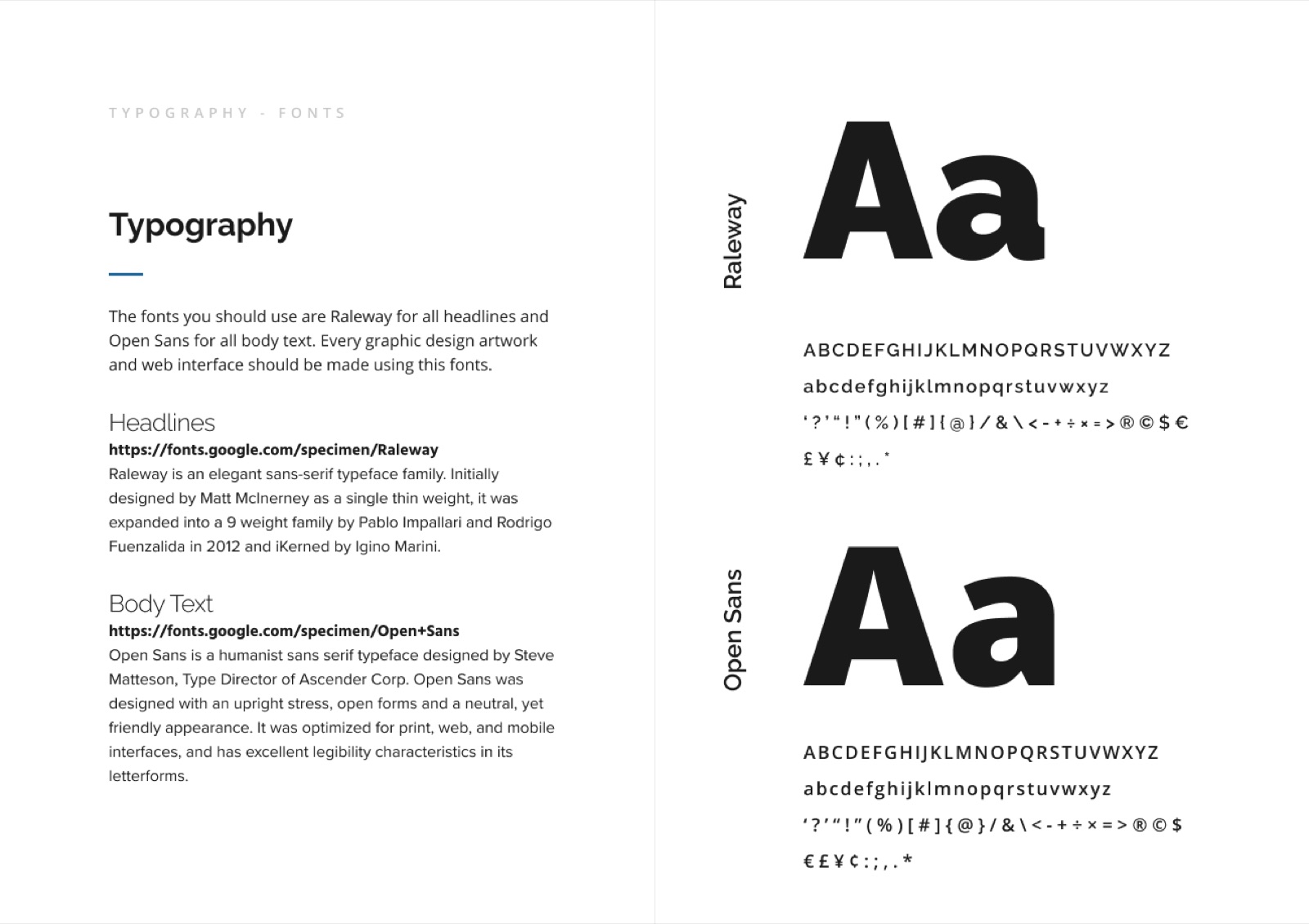
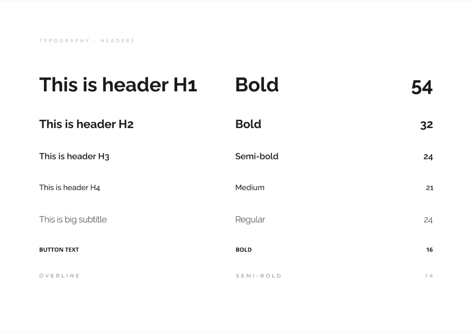
We documented the identity in a proper guide: logo construction and clear space, a mono-color version for single-ink and embroidered applications, and a typography system — Raleway for headlines, Open Sans for body — so every document, deck, and printed piece the firm produces stays consistent, whether it's a client report or a conference banner.
Looking for brand identity like this?
325 Studio works with businesses in Utah and beyond. Tell us what you're building and we'll take it from there.